
Hello Friends!
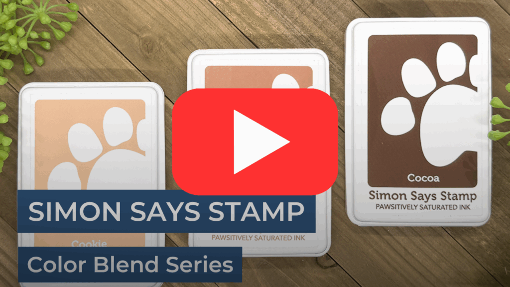
If you’ve been searching for an ink that fills a lot of needs—look no further than Simon Says Stamp Pawsitively Saturated Inks. These incredible inks are a staple in my crafting studio, and today I want to share just a few reasons why they’re my go-to for everything from dreamy backgrounds to coloring bold die cuts.
🌈 Blend Like a Dream
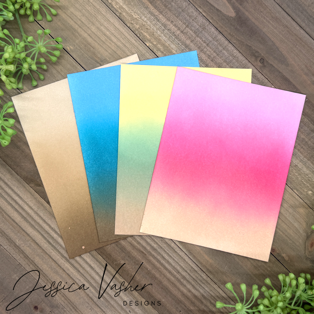
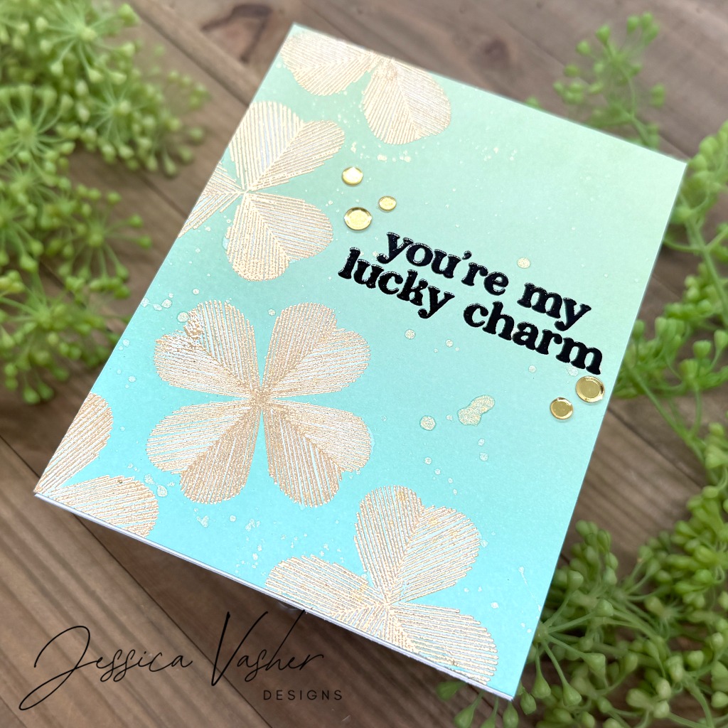
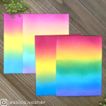
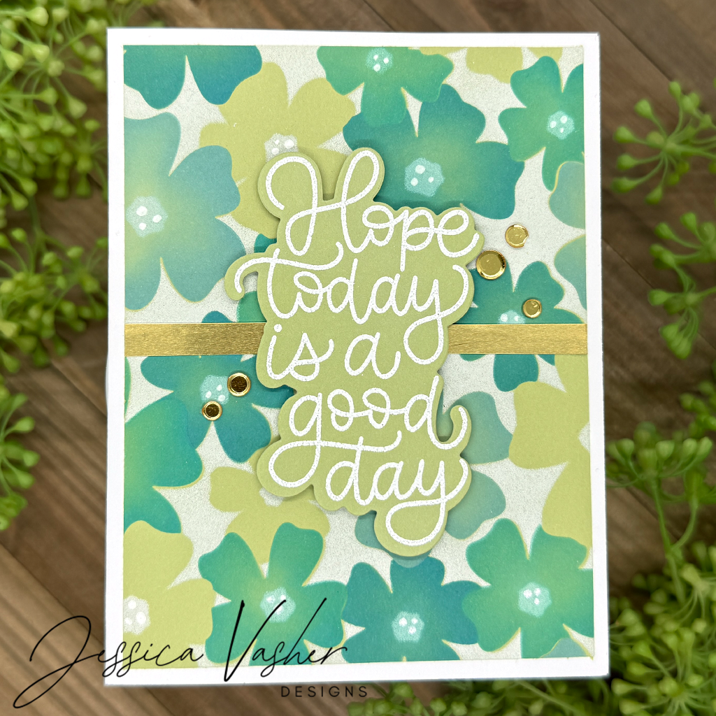
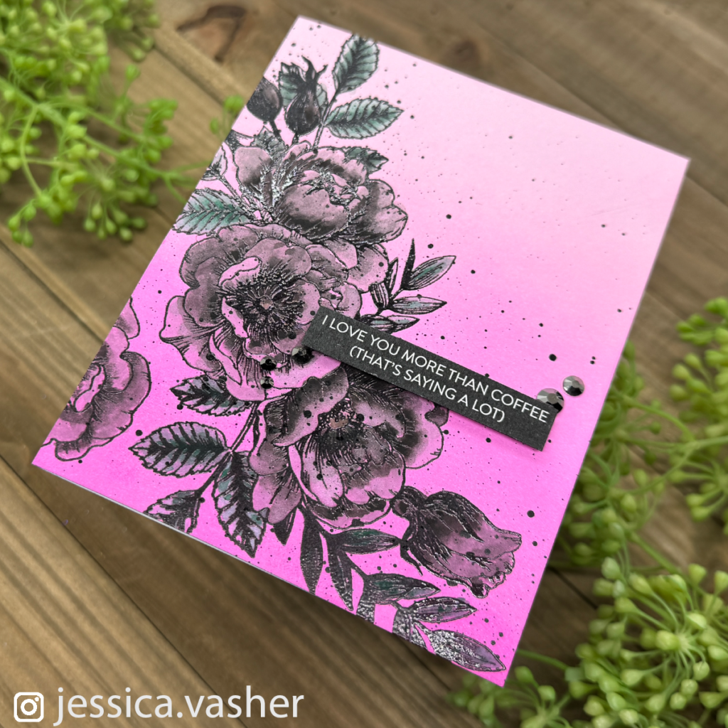
These inks are the definition of smooth. Whether I’m creating a soft gradient sky or layering vibrant florals, the inks glide effortlessly over cardstock and blend together seamlessly. Just take a look at the background on my “You’re My Lucky Charm” card—those subtle transitions from mint to aqua? All thanks to the buttery blendability of Pawsitively Saturated Inks.
💦 Water-Reactive Magic
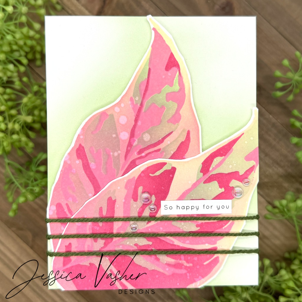
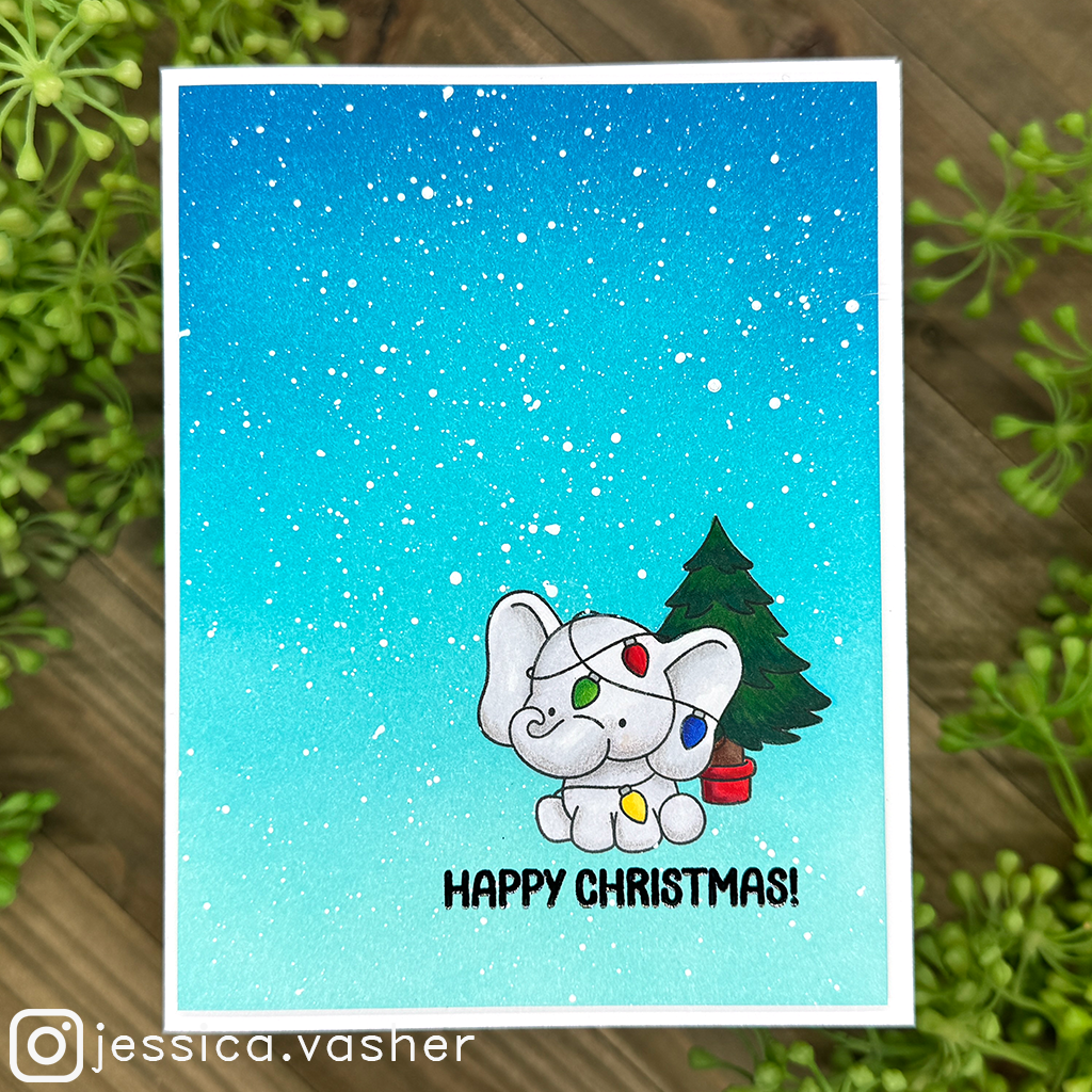
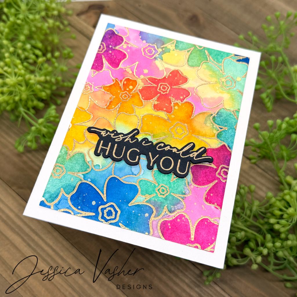
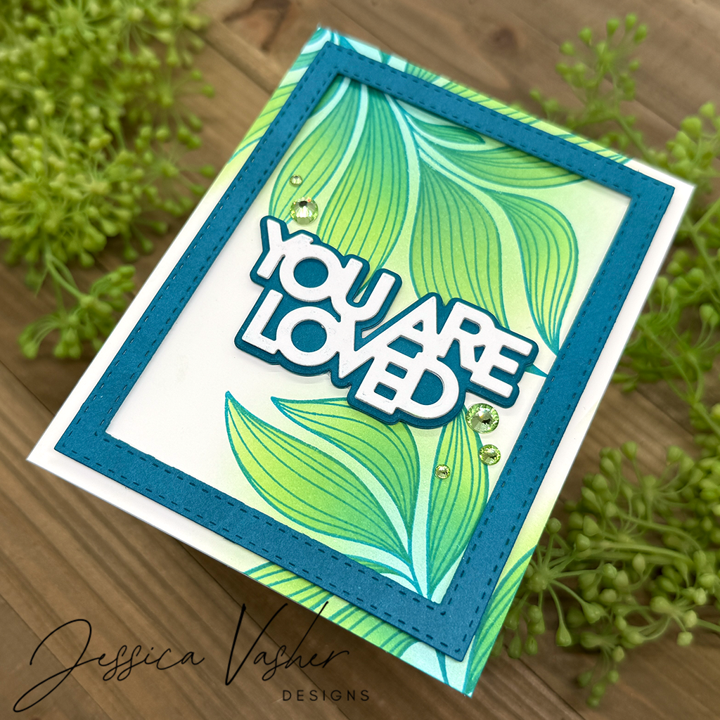
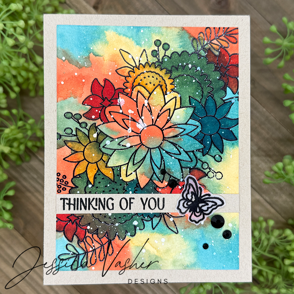
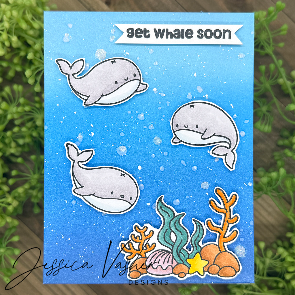
Yes, these inks blend beautifully, but they also react gorgeously to water. That splashy texture on my “You Are Loved” and “So Happy For You” cards? Simply spritzing or flicking a bit of water onto the inked background adds instant depth and artistic flair. This reactivity adds another layer of versatility to your projects—perfect for everything from elegant cards to mixed media creations.
💚 Backgrounds & Die Cuts—One Ink, Endless Possibilities
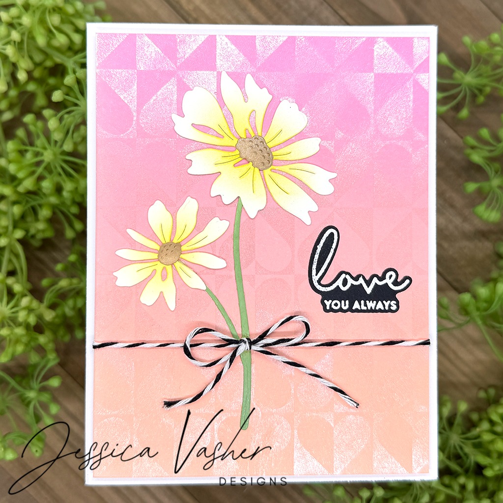
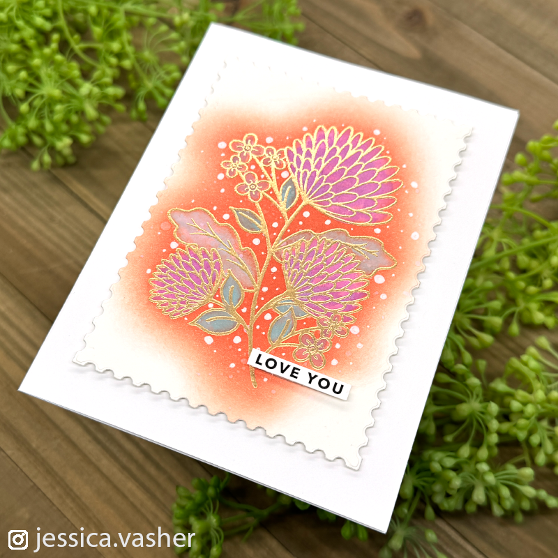
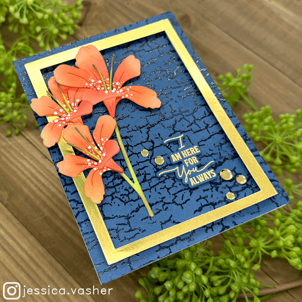
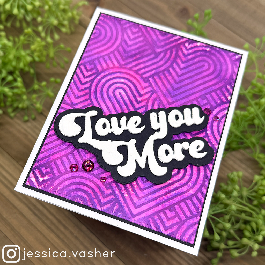
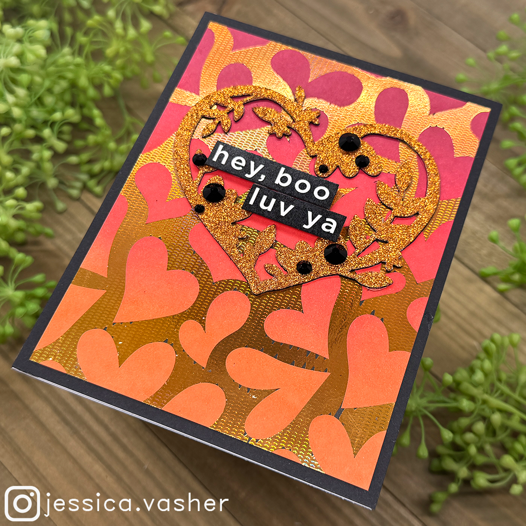
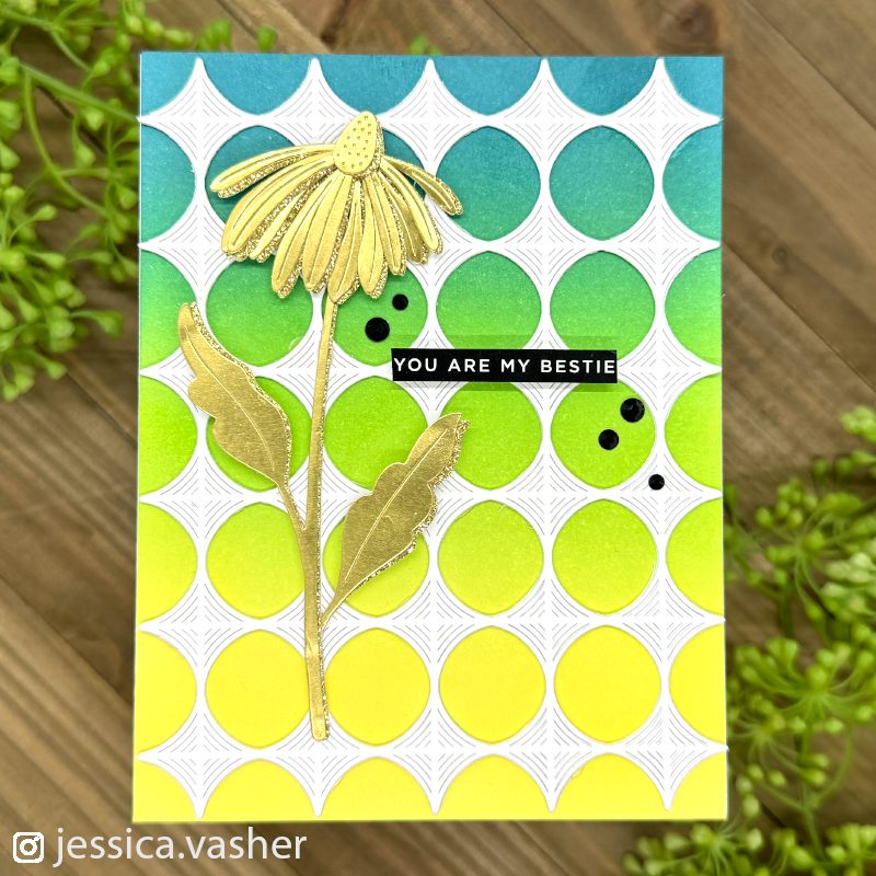
What really sets these inks apart is how well they work on both large surfaces and intricate die cuts. On the “Love You Always” card, I used the inks for both the geometric pink-toned background and to softly shade the flower petals. The coordinated effect adds polish and harmony, making the design pop without needing multiple ink types.
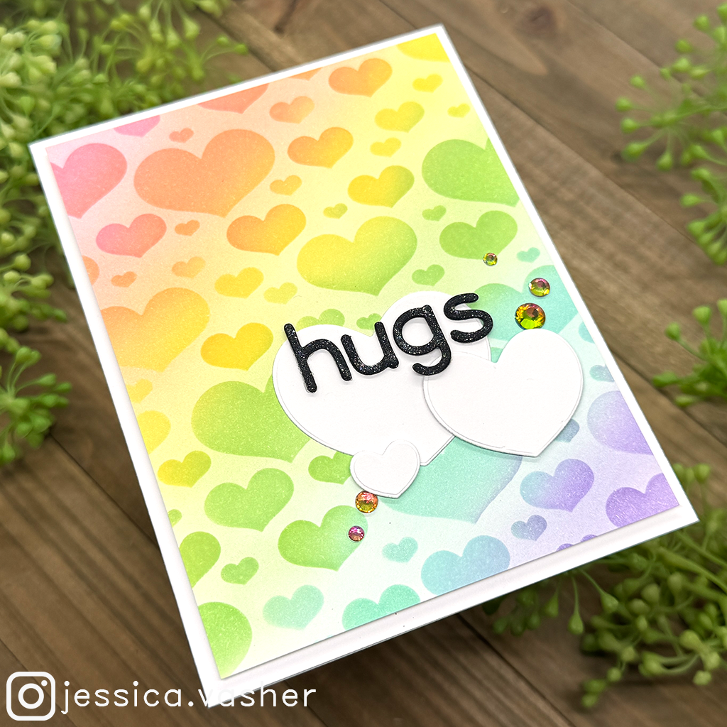
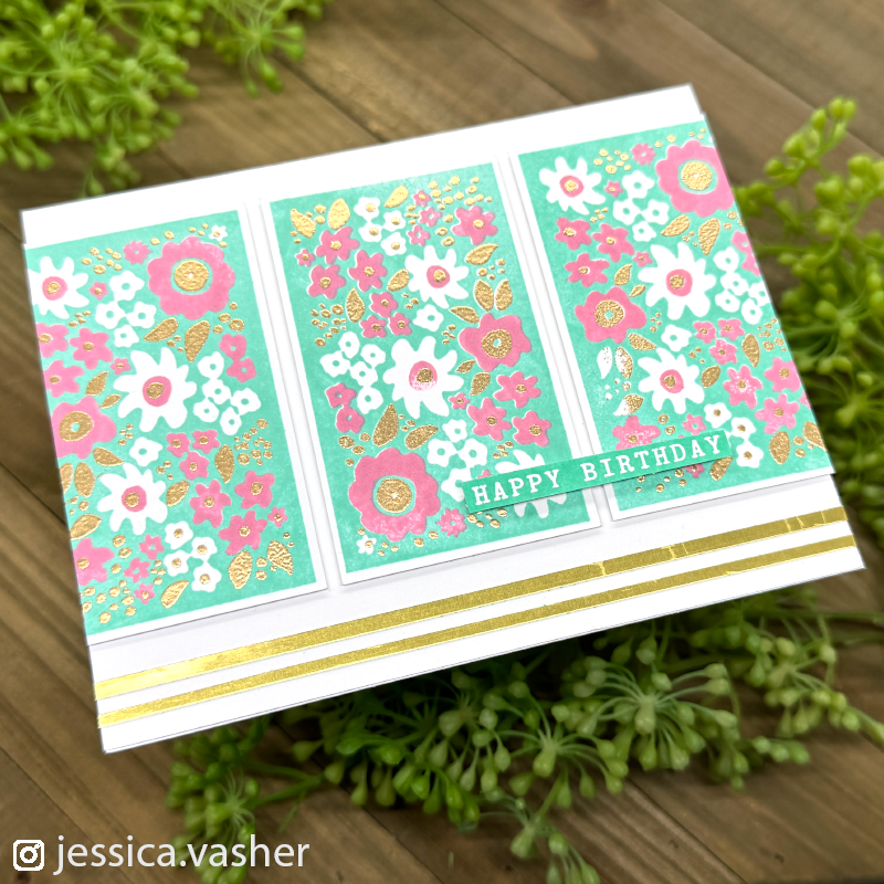
On my “Thanks” card, I used the inks to create a rich purple base that lets the metallic butterflies shine, while in the “Hugs” cards (both the bold floral and pastel heart versions), you can see how well the inks layer and play with negative space.
🎨Watercoloring with Dye Inks
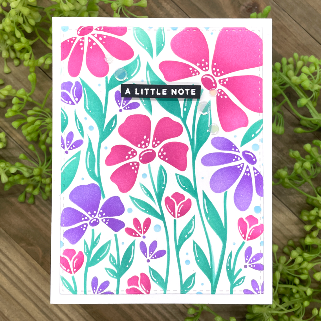
These inks aren’t just for blending—they’re also fantastic for watercolor techniques. Simply press the ink onto a non-porous surface like a glass mat or acrylic block, add a bit of water, and paint away. Whether you’re adding soft washes of color or layering rich tones, the pigment flows effortlessly, making it ideal for florals, backgrounds, or detailed images. It’s like having a mini watercolor palette built into your ink collection.
🧽 Smooth Finish, Every Time
One of my favorite things about these inks is how they dry. Even after heavy blending, they settle into the paper with a soft, smooth finish—no harsh lines, no patchy areas, just pure inky goodness. This means less time fussing with blending tools and more time enjoying the creative process.
🖋️ Not only do these inks blend and watercolor beautifully—they also stamp like a dream. The coverage is crisp, smooth, and consistent, making even the most detailed stamp designs come to life with rich, vibrant color. Whether you’re using solid image stamps or fine line details, you’ll get clean impressions every time. These inks hold up incredibly well on both photopolymer and rubber stamps, making them a reliable choice for any type of project.
In Summary: Why I Reach for Pawsitively Saturated Inks
- Incredibly smooth and forgiving blending
- Stunning reactivity with water
- Gorgeous finish on both backgrounds and die cuts
- Vibrant, buildable color payoff
- Perfect for clean & simple or layered & textured designs
- Great stamping in for crisp clean images
If you haven’t tried them yet, I can’t recommend them enough! Whether you’re a seasoned cardmaker or just starting your ink journey, Simon Says Stamp Pawsitively Saturated Inks are a game-changer you’ll reach for again and again.
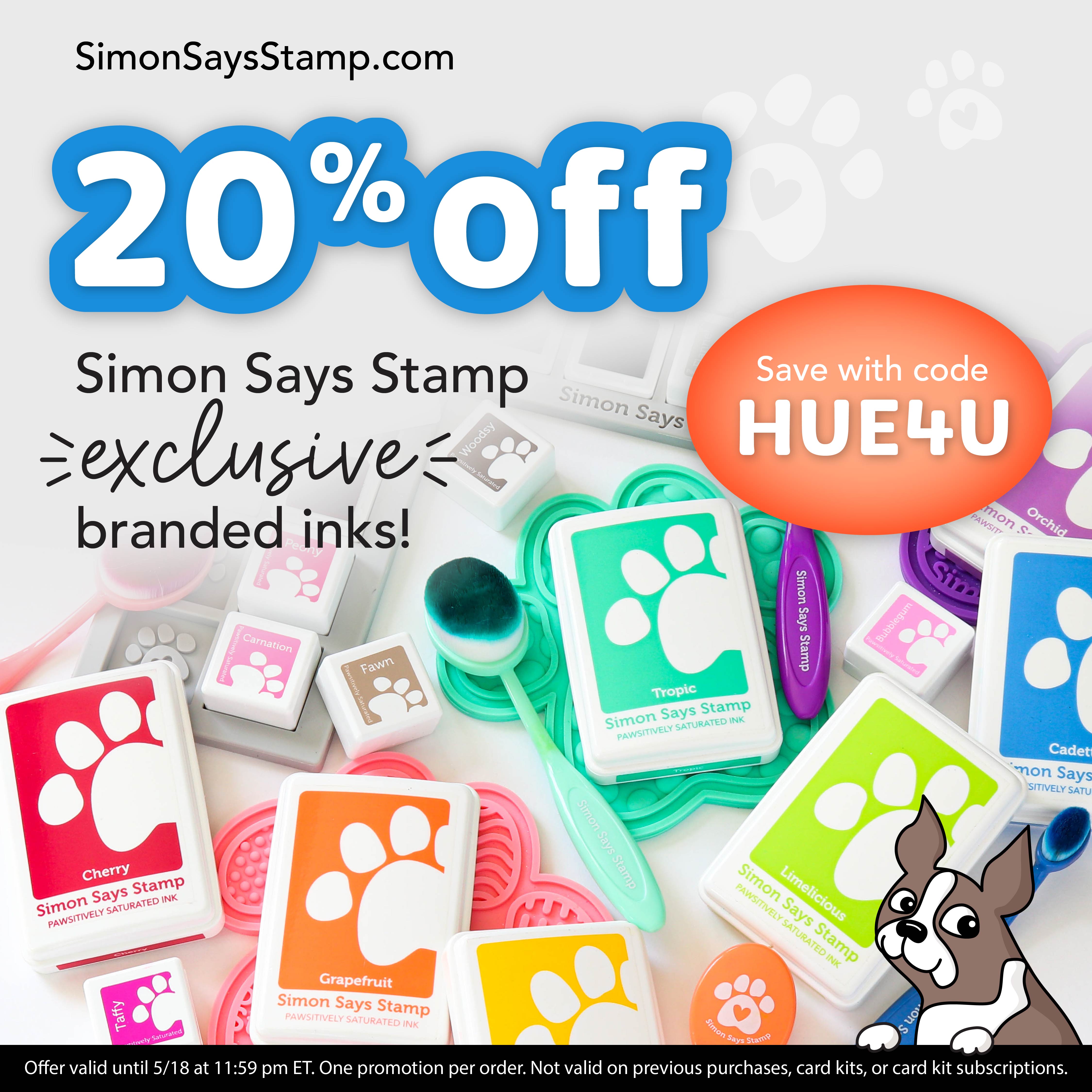
Wanna get in on the fun? – Now’s your chance! Simon Says Stamp is kicking off the weekend with a generous discount code for you to fill your cart with.
✨ Use code HUE4U to save 20% on Simon Says Stamp exclusive branded inks! ✨ This includes the Pawsitively Saturated Inks, re-inkers, and cubes, plus black, white, and clear inks, Versafine Clair, and our Pastel Inks, too. In addition, if the original Simon inks are in stock, it works on those as well—and even the line of Rainbow Splash Inks (which also blend great)! ✨
📺Want to see these inks in action?
I have a full YouTube playlist (AND A NEW VIDEO BELOW!) where I demo how beautifully these inks blend by looking at the trios individuals and then pairing each color with other colors in the line.
Be sure to also check out my new card below and a TON of inspiration.
Happy crafting,
—Jessica
New Video
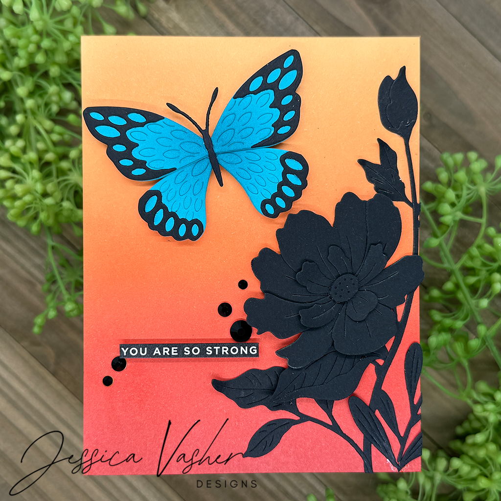
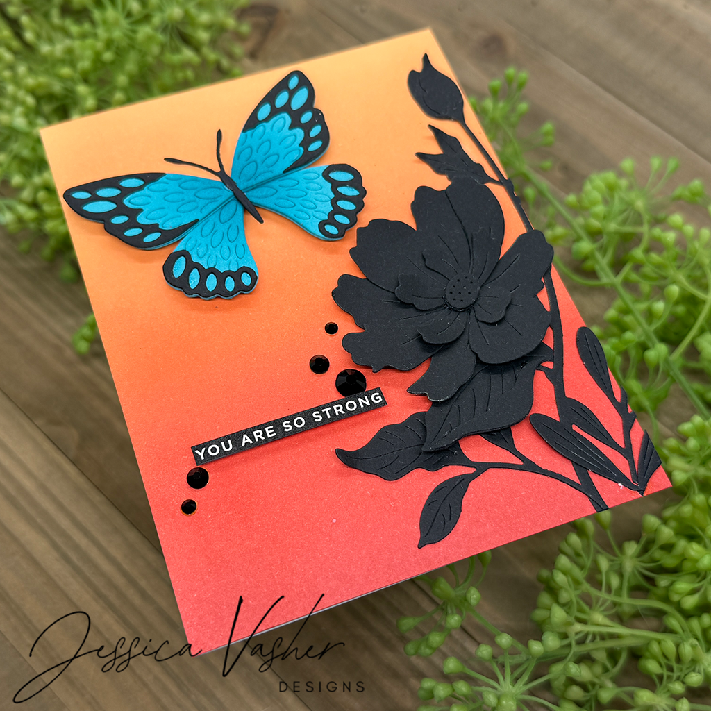
New Card for today’s hop
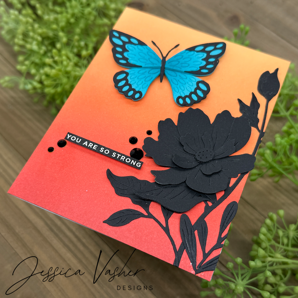
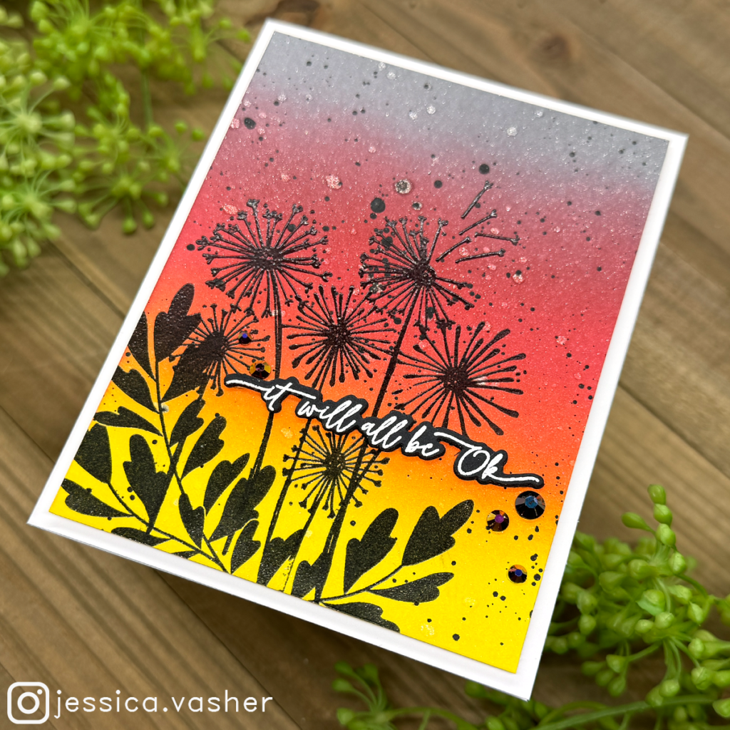
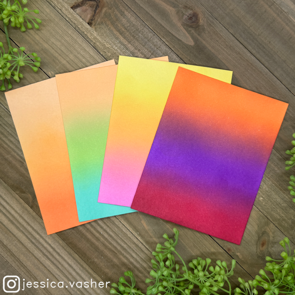
I grabbed some of my favorite oranges and went to work on this sunset background. I used Cantaloupe, Sherbet, Terracotta and Brick. I paired it with some beautiful die cuts for that orange and blue contrast!
Inspiration
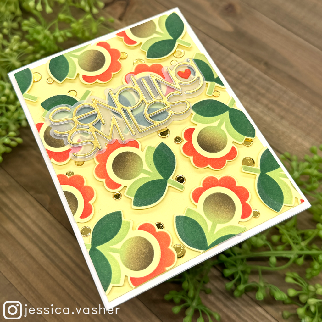
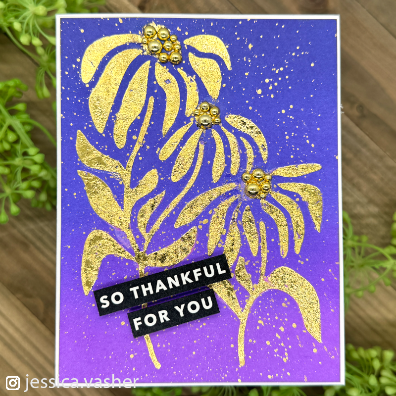
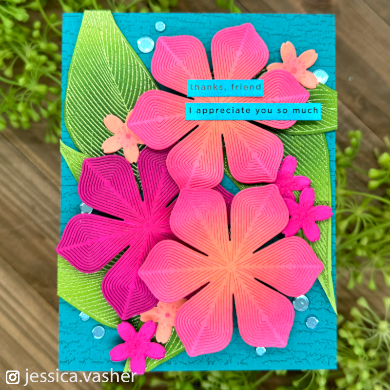
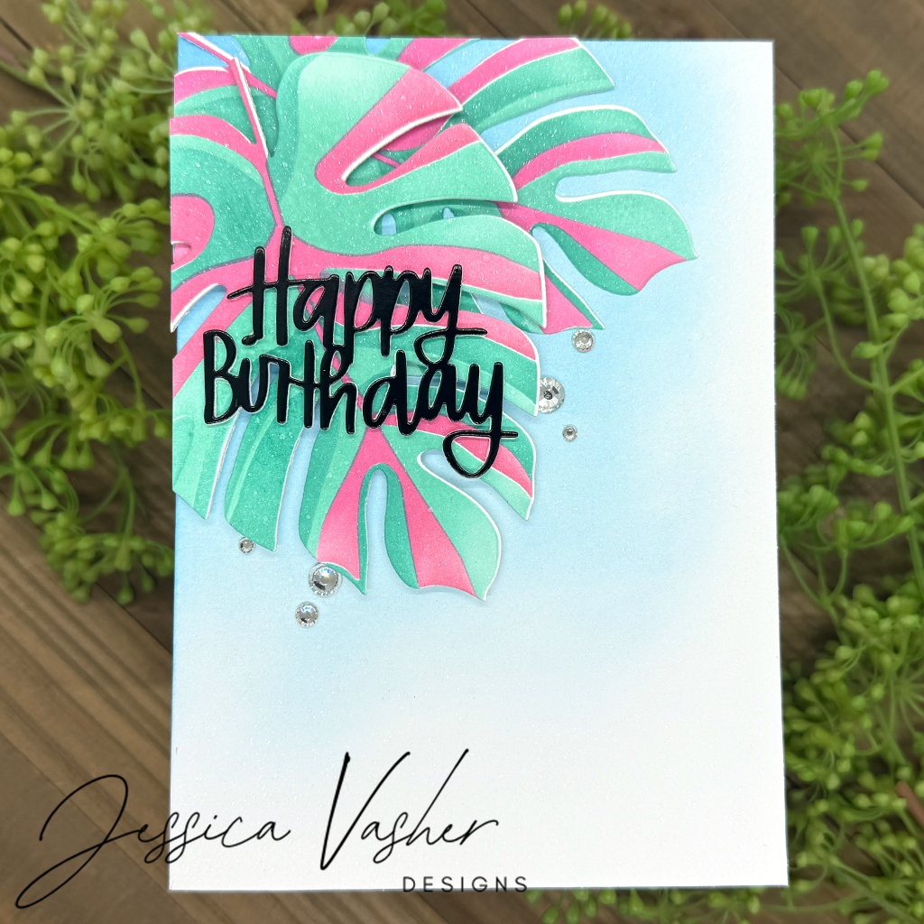
All of these cards have Simon Says Stamp Pawsitively Saturated Inks in various different ways. Some of these images have a video that goes with it! So be sure to hover over photos to check out if there is a tutorial or not.


Blog Hop List
- Simon Says Stamp Blog <—– Up Next
- Cathy Zielske
- Barbara Tarayao
- Mindy Eggen
- Nichol Spohr
- Laura Bassen
- Yana Smakula
- Keisha Charles
- Amy Rysavy
- Emily Midgett
- Bibi Cameron
- Tina Smith
- Jessica Vasher —–> You are here!
Your background blend is amazing! I like the silhouette look with the black die cuts. Tfs!
The blue blend looks just like a pottery glaze!
Your blending is amazing. This is something I need to practice.
Such a striking card! Love it so much! Love all the SSS products & colors!
[…] Simon Says Stamp Blog Cathy ZielskeBarbara TarayaoMindy Eggen Nichol Spohr <—– you are here.Laura BassenYana SmakulaKeisha CharlesAmy RysavyEmily MidgettBibi CameronTina SmithJessica Vasher […]
Such an artistic card. Great ink blending and I like that black flower causing me to notice that beautiful blue butterfly even more. Really went with the sentiment as well. Creative and made me think.
Beautiful I love your blending.
Your card is awesome! I love the use of color and black, too.
Layered black flower = DEAD!
What an amazing post, friend! You killed it!
Great sunset background. I like the combination of the blue butterfly and the black silhouette.
[…] Simon Says Stamp Blog Cathy ZielskeBarbara TarayaoMindy Eggen Nichol Spohr ** NEXT **Laura BassenYana SmakulaKeisha CharlesAmy RysavyEmily MidgettBibi CameronTina SmithJessica Vasher […]
Your background blending is amazing–so smooth and pretty! Your card is lovely too.
Thanks for all the info on these inks from SSS!
I love all the inspiration I’ve found during this blog hop!!!
Your promo and examples have convinced me to buy more SSS inks & make my own coordinating paper!
Beautiful cards!! I am now sure I need to get some of those inks after seeing all the beautiful creations with them on the blog hop!
Beautiful cards!! Your ink blending is wonderful! Thanks so much for sharing your tips and techniques!
Wow these blends are amazing!!
Gorgeous colors
Wow, these colors REALLY pop! What a showcase for this hop this card is!!! BEAUTIFUL!
Lori S in PA
That sunset coloring and blending is just perfect. Beautiful card!
Fabulous cards! Great ink blending skills
When I saw you card it made me say wow out loud and then show my family. Beautiful
Fabulous blends!!! Gorgeous cards!!!!
Gorgeous color combos and cards! Your ink blending looks amazing!
You really have an attention grabbing card! Such bold colors!! Then you sweeten the show with all of your other samples…burning the midnight oil? Nice job!
Beautiful card. Thank you for sharing 🙂
So beautiful!! Love the ink blending